Analyze This: Wildfires are pumping more pollution into U.S. skies
A new model maps wildfire smoke and estimates exposure to harmful particles
A new study estimates levels of fine particles from wildfire smoke that people across the United States are exposed to daily. Researchers used a computer model to figure out what levels might be at places far from monitoring stations.
f00sion/E+/Getty Images
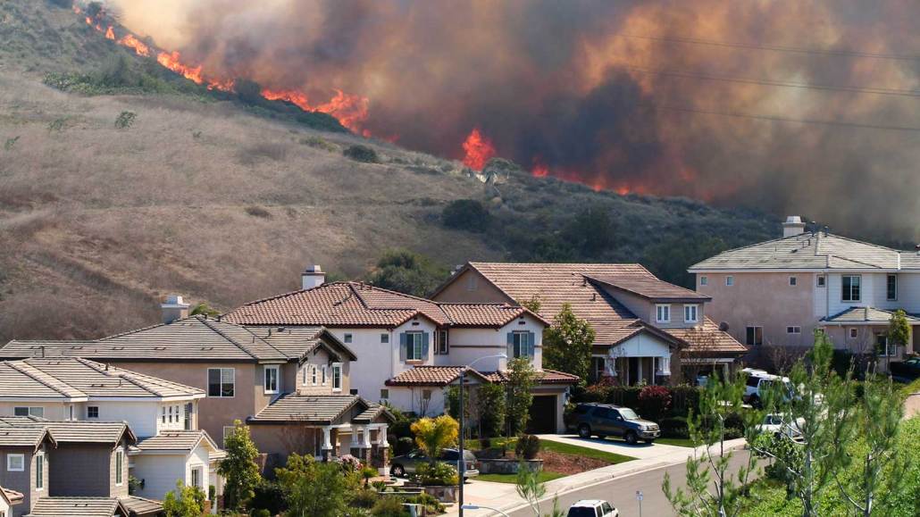
In parts of the western United States, sometimes the sky looks gray and the sun is hidden from view. Not because of clouds but because of wildfire smoke. That smoke contains tiny particles, which are harmful to health. Now, researchers have found that exposure to such pollution has grown in the United States over the past decade as wildfires have gotten bigger and more common.
“There’s so many health effects from particulate matter,” or PM, says Marissa Childs. An environmental health researcher, she works at Harvard University in Cambridge, Mass. Especially concerning are really small particles, called PM2.5. These are smaller than 2.5 micrometers. That’s about one-thirty-fifth the thickness of a sheet of paper.
Health risks from such particles include asthma and shorter lifespans. Childs and her colleagues wanted to better understand the health effects of PM2.5 from wildfire smoke. But first, they needed to know how much exposure to it people in different places were having. So, the researchers set out to map this pollution.
First, they gathered data on PM2.5 levels from about 2,000 air-monitoring stations across the United States. Satellite images of plumes of wildfire smoke allowed the researchers to estimate how much of the PM2.5 in each place appeared to come from this smoke.
Vast areas, however, have no monitoring stations. To estimate smoke PM2.5 in those places, Child’s team started with the satellite images of smoke plumes. Then they trained a computer model to calculate smoke PM2.5 levels, in part, based on those images. The model considered many factors, including wind direction and speeds, temperature and distance to the fire.
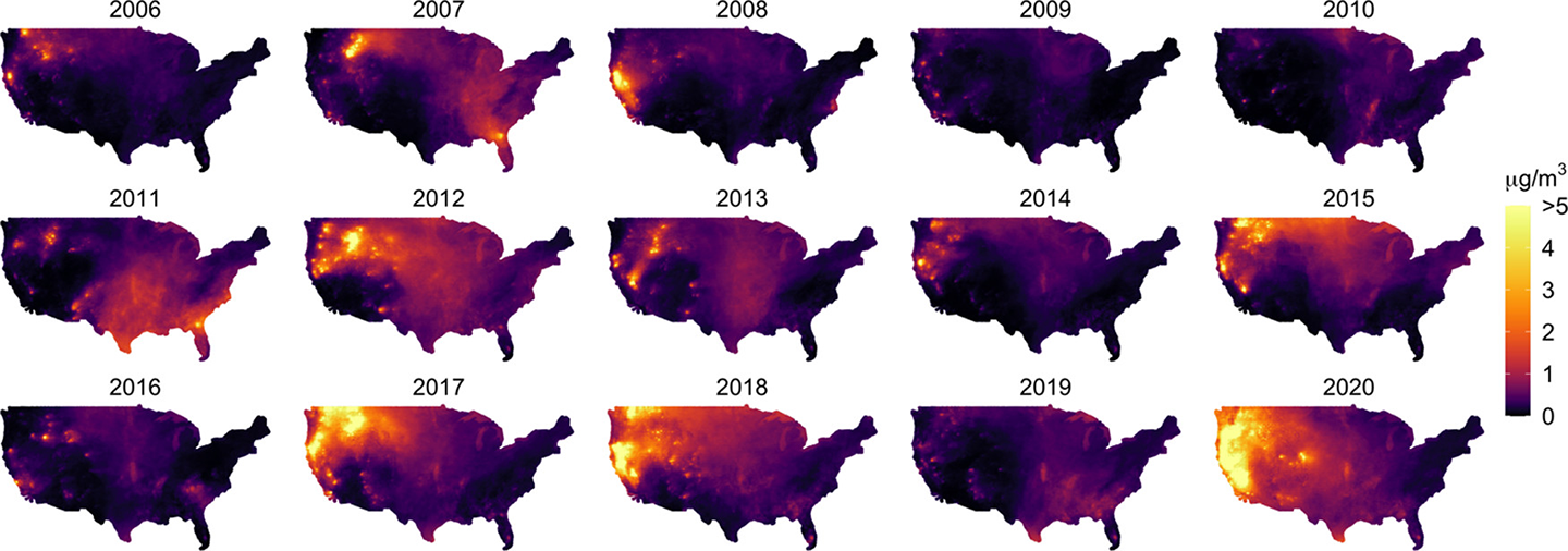
This allowed the team to estimate the daily PM2.5 from smoke to which people across the continental United States were exposed during 2006 to 2020. (The map did not include Alaska or Hawaii.)
“We especially see a really large increase in the number of extreme days with high pollution levels,” says Childs. In 2020 alone, 25 million people experienced at least one day where PM2.5 levels were over 100 micrograms per cubic meter. On days with such high pollution, people in affected areas shouldn’t be spending a lot of time outside.
The researchers shared their findings in the October 4 Environmental Science & Technology.
“It is time that we start treating wildfires like a critical social problem,” says Childs. Particle pollution from smoke isn’t regulated under U.S. clean-air laws. That “might have made sense 10 years ago, when [wildfires] were exceptional,” Childs says. Now, there are places that routinely experience unhealthy levels of particles from wildfires. “We can’t think of them as exceptional anymore.”
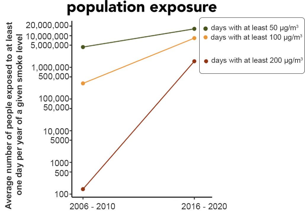
Increasing smoke exposure
This graph shows the change in exposure to extreme levels of PM2.5 from smoke over the last decade. Days with PM2.5 levels above 50 micrograms per cubic meter (mg/m3; green line) are considered extreme days. The yellow line shows days with greater than 100 mg/m3. The red line shows days above 200 mg/m3. The y-axis is on a logarithmic scale. That scale more easily shows the huge range of smoke exposure.
Researchers calculated the number of people exposed to at least one day a year at these levels. They averaged those results from 2006 to 2010. They also averaged the results for 2016 to 2020. The change across the last decade is the later years’ value minus the earlier years’ value.
Data Dive:
- Look at the maps of the United States. From 2006 to 2020, which years have the highest concentrations of smoke PM2.5?
- What parts of the country have the highest levels of smoke PM2.5 in those years? What parts have the lowest levels?
- How do smoke levels from 2006 to 2010 compare to those from 2011 to 2015? How do those between 2011 and 2015 compare with those between 2016 and 2020?
- Look at the graph. What is the value for days greater than 50 micrograms per cubic meter (mg/m3) for 2006 to 2010? What is it for 2016 to 2020? How much larger is the value from the later years?
- What is the value for days greater than 200 mg/m3 during 2006 to 2010? What is it for 2016 to 2020? How much larger is the value in the later years?
- Which exposure level of PM2.5 increased the most drastically? Why do you think that is?
- Why do you think the researchers chose to average across five years of data to calculate differences that happened in the last decade? What would happen if they instead used only a single year where there were more wildfires, such as 2020?


