Explainer: Data — waiting to become information
Information represents the analysis that brings value to numbers and other factoids
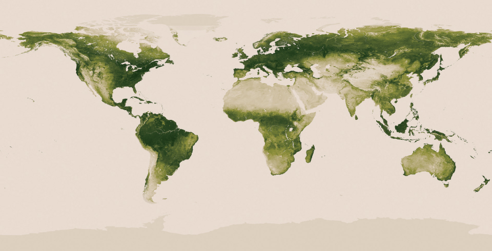
Satellite data on plant cover (summer 2012 shown here) was displayed by site on a globe of the Earth to provide information about which areas can absorb carbon during photosynthesis and which areas would likely suffer most from drought or fire.
NASA/NOAA

Governments, businesses and other organizations pay huge sums of money to collect data. Their goal is to better understand something vital to their mission. It’s not those data that really interest them, however. What they want is information — knowledge that comes from finding trends in the data
For instance, climate scientists may want to learn whether Earth’s gradual warming has been occurring in all places and at the same rate. City leaders may want to know if they will need to build more schools — and how soon. Companies may want to know what products people want, if age or race plays a role and how much people are willing to pay for those products. Political groups may want to know what issues people care about most. They will also want to know if people likely would vote for a candidate who doesn’t support the issue that’s most important to them. And school districts may want to know whether children are developing important learning skills — and if not, why.

To begin answering such questions, each group may collect vast mountains of data. These may include measurements of air temperatures. Major manufacturers may collect consumer-spending records from cash-register receipts at stores that sell their products. Politicians may commission public-opinion polls. And schools: Well, they will probably pore over student scores on achievement tests. Schools also will look at tallies of the time teachers report spending in the last year covering particular topics in their classrooms.
The measurements these groups accumulate are not information, however — at least not yet. To convert numbers from a thermometer or answers on a survey into information, people must first extract trends.
What share of people, for instance, answered a survey question in one way? Did people in their 20s answer differently from those in their 40s or 70s? How do the temperatures in cities around the world differ from each other this year? And even more importantly, how do those differ from the temperatures last year or 10 years ago — or even from those a century ago?
For instance, the number of people in a town would represent data. If you group the people of every age by their neighborhood, city planners might learn that the elderly primarily live in one place. That’s now useful information, because it suggests the town could set up a center to provide services for those people in a spot that’s close to them. Or the data might show that the only place to affordably create a new senior center is nowhere near where the seniors live. That would suggest officials would have to develop a bus service to bring senior citizens to such a center.

Collecting more data usually makes it more likely that the findings will capture important details about the topic being studied. But how can the human mind make sense of 200,000 numbers, much less a million? That’s where graphing can help.
You’ve heard that
a picture is worth a thousand words. That may be an exaggeration. But pictures and graphs can certainly illustrate ideas in ways that columns of numbers spanning hundreds of pages cannot.
Information can be pulled out of data in many ways. Sometimes it is by finding trends: Data can yield information about what most people in some group think. They also can reveal whether most other people actually don’t share the ideas of one especially outspoken person. When data can answer that, information now emerges.
Sometimes grouping data and illustrating them next to each other — in columns on a bar chart, for instance — can show at a glance which group is biggest and by how much. Or, by color-coding data, a map might show how regions differ by temperature, rainfall, number of animal species or numbers of people with cancer. If one region stands out as a hot spot, that is information. Why? It suggests some issue that researchers might test to learn why that region stands out.
Often, information emerges best when different types of data are superimposed — that is, they are laid atop one another. For instance, a map may use red to highlight states with high obesity rates. It may color blue those states with high diabetes rates. If most of the colored states are actually purple, indicating a combination of red and blue, that
information
might suggest that obesity and diabetes are linked. Or if it turns out that most cases of kidney stones occur in the southeastern United States, researchers can then work from that
information
to probe what aspect of the environment, climate, diet or cultural attributes of people in the Southeast might put them at greatest risk.
Images throughout this piece illustrate ways numbers — data — can be displayed to give them meaning, and thereby transform them into information.


